For Queries Call Us @+91 9818442666
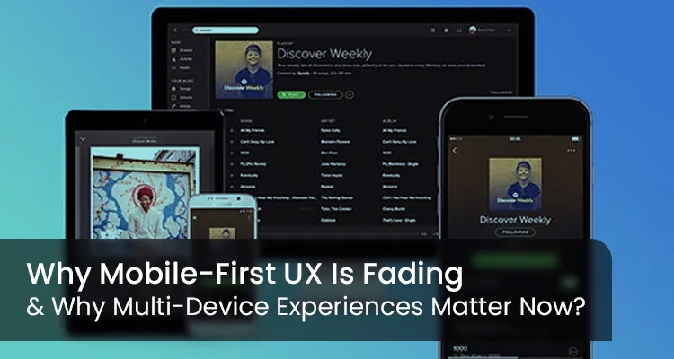
For more than a decade, mobile-first ux thinking has shaped product design. It grew from a period when smartphones became the main doorway to the web, and teams rushed to create lighter layouts and quick interactions suited to small screens.
That approach worked then, but the digital world has widened since. People now shift across several devices while handling a single task.
They may begin on a phone, check details on a laptop, glance at a reminder on a watch, and return to a tablet to finish what they started. Their habits have moved far beyond the older model.
A strictly mobile-first ux lens no longer matches how people work or explore information. Design has turned toward multi-device experiences, where a product adjusts to each screen and supports the user throughout the journey.
The aim is no longer to compress everything for a phone but to build a connected flow that fits real life.
People use different screens for different reasons-
These movements feel normal and unplanned. No one thinks, “Now I will switch devices.” They simply pick up what feels right at that moment.
A mobile-first layout often restricts the experience. It tries to fit every idea into the smallest screen, even when a task requires more detail, more room, or a more relaxed format.
This leads to designs that feel narrow or repetitive across devices. Users need flexibility, not limitations.
The shift in behaviour is not driven by technology alone. It reflects the rhythm of modern life.
People balance work, study, rest, and travel throughout the day. They expect a product to follow them through all these moments with ease.
Phones no longer sit alone in a digital bubble. They connect with watches, speakers, home devices, car dashboards, and cloud systems.
Even simple tasks can pass through several screens. Fitness data offers a clear example. A step count appears on the watch, a weekly chart opens on the phone, long-term insights show on the laptop, and guided sessions play on the television.
Each device contributes something unique and helpful.
mobile-first ux design cannot capture this entire journey. It focuses on reducing the product to its smallest form rather than expanding it to its fullest expression. A multi-device approach recognises the value of every screen in the user’s environment.
Designing for several devices brings many advantages that go beyond convenience. It creates a more complete, confident, and natural flow for the user.
One of the strongest benefits is the ability to pause on one device and continue on another. This ease builds trust. Users do not feel the frustration of repeating steps. The system remembers their place and respects their time.
Laptops and tablets offer space that mobile screens cannot provide. Research, comparison, long lists, and deep reading feel more comfortable on larger displays. A multi-device approach lets designers expand features where they make the most sense.
Short sessions on a phone combine with longer sessions on a computer. This keeps users connected to the product in a natural cycle throughout the day. It strengthens brand presence without feeling intrusive.
Not all users rely on phones as their primary gateway. Students, working professionals, and older audiences often prefer laptops or tablets. A balanced design respects these differences and avoids excluding groups that need clarity and comfort.
A system built across devices adapts more easily when new interfaces appear. Smart home screens, car consoles, AR glasses, and other platforms become easier to support. This gives the business long-term strength.
A multi-device approach does not replace mobile design. It gives mobile its rightful role within a larger network. Each screen type does something well, and the design should reflect that strength.
When a product adapts to each environment, it feels polished and thoughtful.
The journey reveals how a person moves through a task. Mapping the steps exposes the moments where device switching is natural. This helps designers distribute features across screens with purpose.
The product should feel familiar everywhere. Consistency in colours, structure, text styles, and interactions builds a sense of comfort. Users recognise the service instantly, even when the layout changes.
Rather than shrinking or stretching one layout, designers should tailor the experience to each device. Space, input methods, and viewing distance all matter. This results in clearer interfaces and smoother interactions.
Progress saving, syncing, handoff links, and shared data are essential. Users should never feel like they are starting from zero after switching screens.
Technology evolves quickly. A product that already supports several devices can adapt without a major redesign. This protects the business from future disruptions.
The deeper change behind this movement is emotional. People value ease. They want to feel understood.
A product that shifts smoothly between devices seems to respect their schedule, attention, and comfort. It supports their daily life rather than interrupting it.
When users feel this sense of ease, they form a stronger bond with the product. They complete more tasks, revisit the service more often, and recommend it more freely.
Loyalty grows not from features alone but from a feeling of being cared for.
Companies that cling to a mobile-first mindset risk offering an experience that feels narrow and outdated. Digital behaviour has expanded far beyond the phone.
Research-heavy decisions, career tasks, education, finance, entertainment, and health tracking often cross several screens.
Businesses that deliver a multi-device experience gain:
These strengths matter in a world where users expect effortless transitions.
The digital world is no longer defined by a single screen. Mobile remains important, but it is only one part of a wider ecosystem.
Users want freedom to begin on any device and finish on any device. They want comfort, clarity, and a sense of being supported.
mobile-first ux opened an important chapter in design, but the next chapter belongs to multi-device experience design. Products built this way feel complete, human, and ready for the years ahead.
ITCombine continues to help businesses make this shift with thoughtful, future-ready digital experiences that work smoothly across every device.
Tanya is part of the expert content marketing team at ITCombine. She has an expertise of curating meaningful information that can be used by visitors in general. Tanya is also involved in creating Client specific stories and blogs.


Copyright © 2025 - itcombine.com.
All Rights Reserved.