For Queries Call Us @+91 9818442666
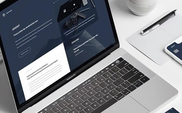
Dark mode is a display setting that uses dark backgrounds and light text. It contrasts with traditional light mode, which features dark text on bright white backgrounds. The design prioritizes reducing glare and offering comfort in low-light conditions. Dark mode in web design typically features shades of black, grey, or other dark tones for the background. This makes text and icons stand out clearly, ensuring readability. While it may seem like a simple color scheme change, dark mode is much more than that. Its functional benefits, from reducing eye strain to conserving battery life, have driven its widespread adoption. This feature offers a personalized and practical experience for users, adapting to their needs across different environments.
Dark mode significantly enhances eye comfort, especially in low-light settings. Bright screens can strain your eyes, causing discomfort and headaches. Dark mode reduces the screen’s glare, creating a more soothing experience for prolonged use.
Additionally, dark mode minimizes exposure to blue light, which can disrupt sleep cycles. Reducing this light helps users who scroll through their devices at night enjoy better sleep quality. For people with light sensitivity, dark mode’s softer contrast reduces discomfort and allows easier screen interaction.
By improving readability and focus, dark mode supports productivity. People who work long hours on screens find it less taxing on their eyes. This practical benefit makes dark mode ideal for those who value both comfort and efficiency.
Dark mode’s rise in popularity stems from its mix of style and functionality. Its sleek and minimalist design has become a favorite among users, making digital interfaces appear modern.
Battery efficiency is another significant factor. Devices with OLED or AMOLED screens save energy with dark mode, as fewer pixels light up. This feature appeals particularly to mobile users who want to extend their battery life.
Customization also adds to its appeal. Users enjoy the flexibility to toggle between light and dark themes based on their preferences. Many platforms let users schedule dark mode, making it switch automatically at specific times, such as at night.
In low-light environments, dark mode is less distracting, offering a more comfortable experience. Its practicality and aesthetics make it a versatile option for diverse user needs.
There are countless reels about dark mode. Click the link to explore them now!
https://www.instagram.com/p/DAvevS2tbLN/?igsh=aDV1dWMyM3M2dGlq
https://www.instagram.com/reel/DCrpI6EBMNB/?igsh=M3M4MHFueDYydG0z
Leading tech companies have embraced dark mode, integrating it into their systems and applications. Apple introduced dark mode in macOS Mojave and iOS 13, making it a system-wide feature. Users can switch between light and dark themes effortlessly.
Google followed suit with Android 10, implementing dark mode across its ecosystem, including Gmail and Chrome. Social media platforms like Twitter and Instagram quickly added dark mode options, catering to user preferences.
Windows 10 also supports dark mode, applying it to system menus and file explorers. These companies’ adoption reflects the feature’s popularity and its importance in modern digital design.
While dark mode has many benefits, it’s not perfect for every situation. Some users find light text on dark backgrounds harder to read. People with astigmatism may experience blurred or distorted text due to high contrast.
Dark mode also performs poorly in bright environments, such as outdoors. Screens may become harder to see compared to light mode, which excels in well-lit settings. Accessibility remains a concern, as dark mode doesn’t cater equally to all users. Offering both light and dark options ensures inclusivity and user satisfaction.
Creating effective dark mode designs requires thoughtful consideration. Designers must prioritize contrast to ensure text and elements are easily visible against dark backgrounds. Avoid pure black backgrounds; instead, use dark gray tones to soften contrasts and improve comfort.
Testing designs in different lighting conditions is crucial for ensuring usability. Visual hierarchy should remain intact, with interactive elements clearly distinguishable. A well-executed dark mode interface balances functionality and aesthetics seamlessly.
Dark mode represents more than a passing trend—it’s a response to user needs for comfort, efficiency, and style. Its ability to reduce eye strain and conserve energy makes it a valuable feature.
As more platforms adopt dark mode, innovation will continue. Designers will refine its implementation to suit diverse users and environments. However, dark mode’s true strength lies in providing choice. It allows users to personalize their digital experience, making technology more adaptable.
This growing trend signifies a shift toward user-centric design. Dark mode emphasizes the importance of inclusivity, flexibility, and well-being in a screen-dominated world.
Dark mode has transformed how we interact with digital devices. It blends practicality with modern aesthetics, offering a user-friendly alternative to traditional light interfaces.
Its benefits, from reducing eye strain to saving battery life, resonate with users worldwide. Major platforms’ widespread adoption underscores its significance in digital design. By prioritizing comfort, functionality, and customization, dark mode is here to stay.
This feature reflects the evolution of technology to meet user demands, proving that sometimes, embracing the dark is the way to illuminate a better experience.
Content written by-Gunjan
Gunjan is part of the expert content marketing team at ITCombine. She has an expertise of curating meaningful information that can be used by visitors in general. Gunjan is also involved in creating Client specific stories and blogs.


Copyright © 2025 - itcombine.com.
All Rights Reserved.